work it – Co-Working Identity
Details
PROJECT OVERVIEW
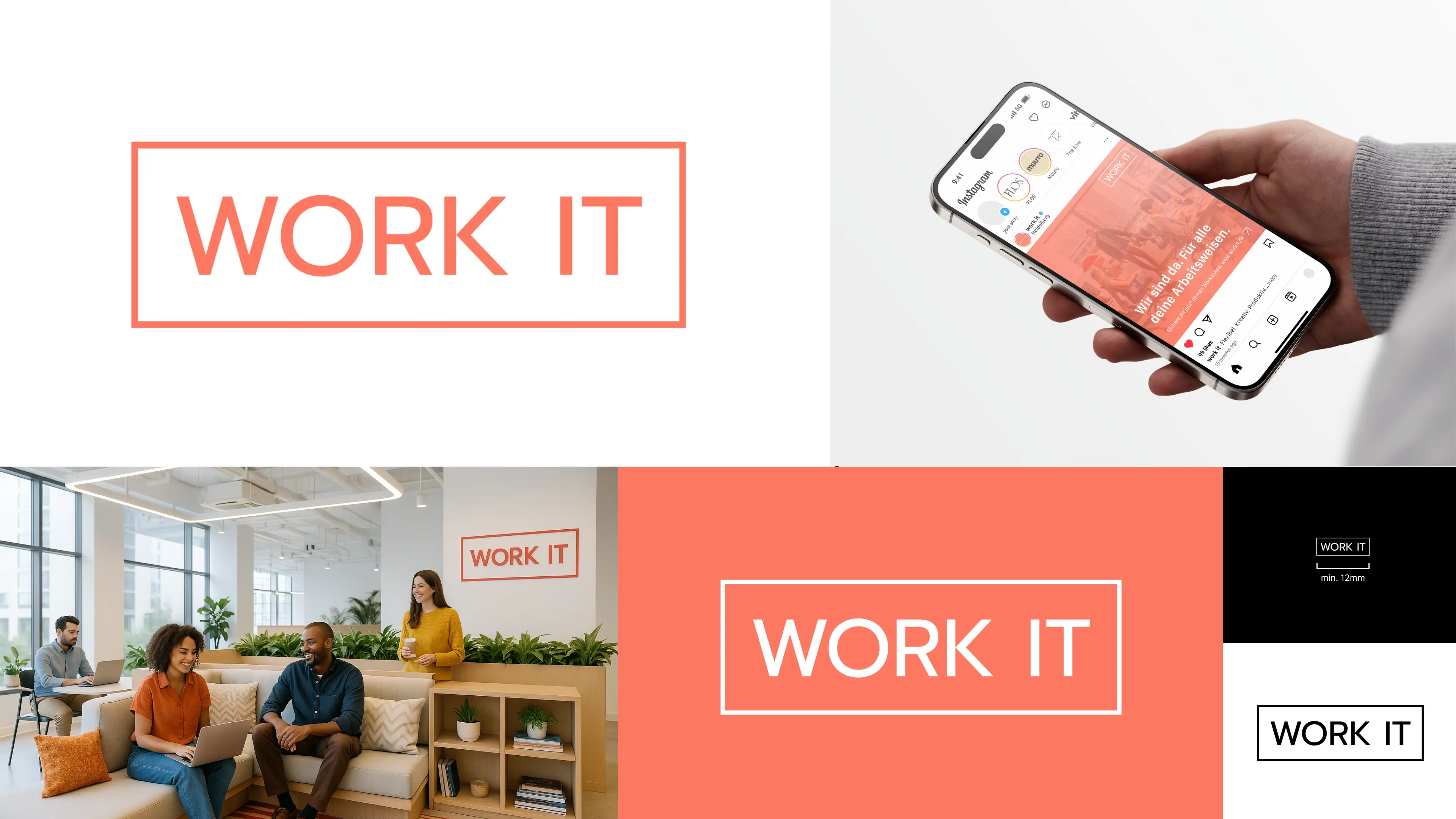
For the conceptual Co-Working Space “work it”, I developed a cohesive corporate design with a strong focus on identity, consistency, and target audience appeal. The project included logo design, a responsive website layout, a custom icon set, and various promotional materials such as posters, stickers, and social media creatives—crafted to appeal to a modern, urban, and creative professional audience in Heidelberg.
CHALLENGE
The goal was to create a visual identity that resonates with both startups and established businesses—flexible, inspiring, and professional. All design elements (from posters and digital screens to icons and logos) had to be coherent and adaptable across various platforms. The biggest challenge was to create a unique visual language that communicates the core values of “work it”: flexibility, diversity, authenticity, and inspiration—while staying recognizable and functional in both print and digital environments.
SOLUTION
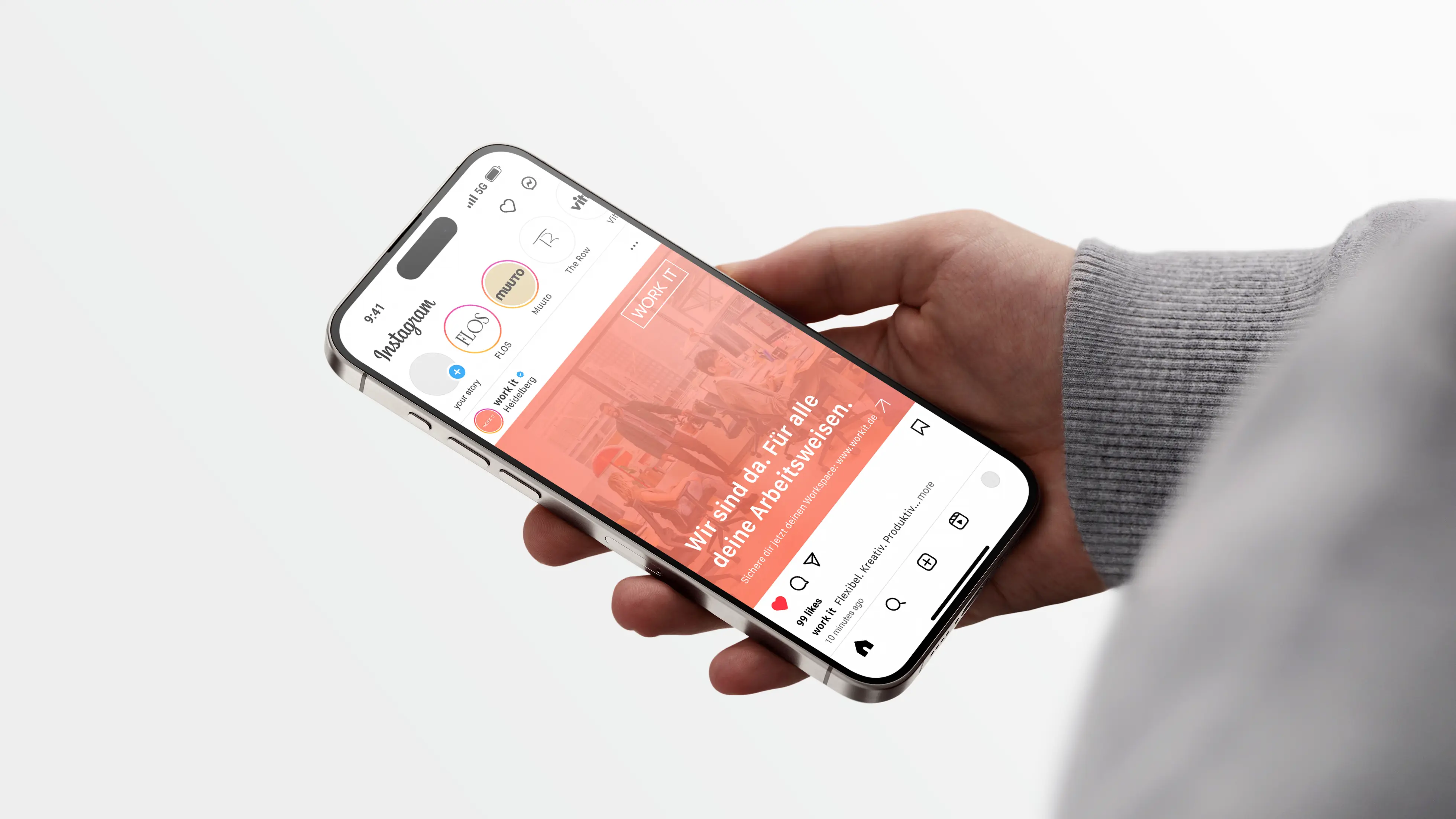
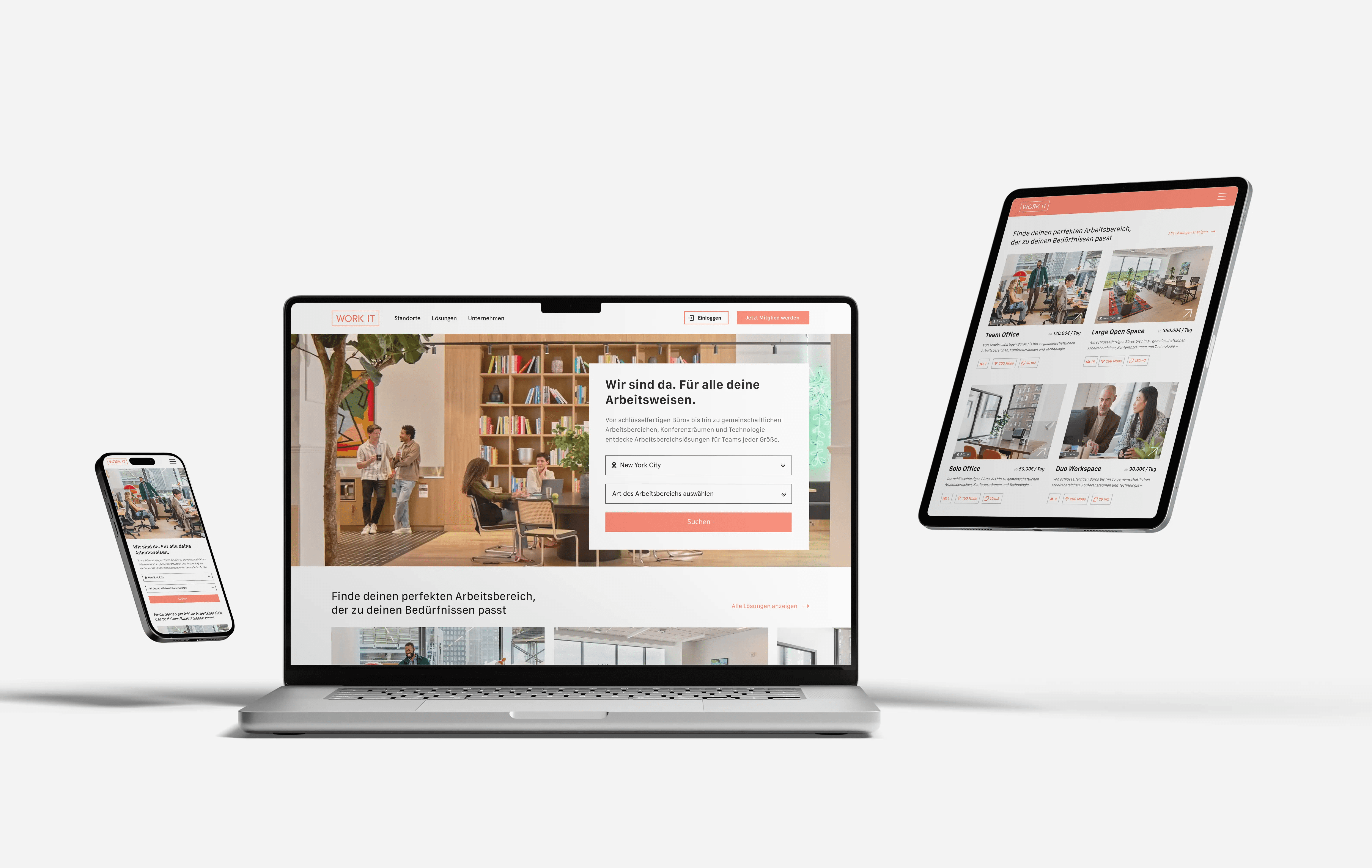
Inspired by design systems used by brands like WeWork, I crafted a modular and scalable design concept with a distinctive logo, a clean icon series, and a responsive screendesign tailored for cross-device experiences.
Key aspects of the solution include:
• Logo Design: Three scalable variations (full color, grayscale, black/white) optimized for different media
• Screendesign: Responsive layouts focusing on user experience and storytelling
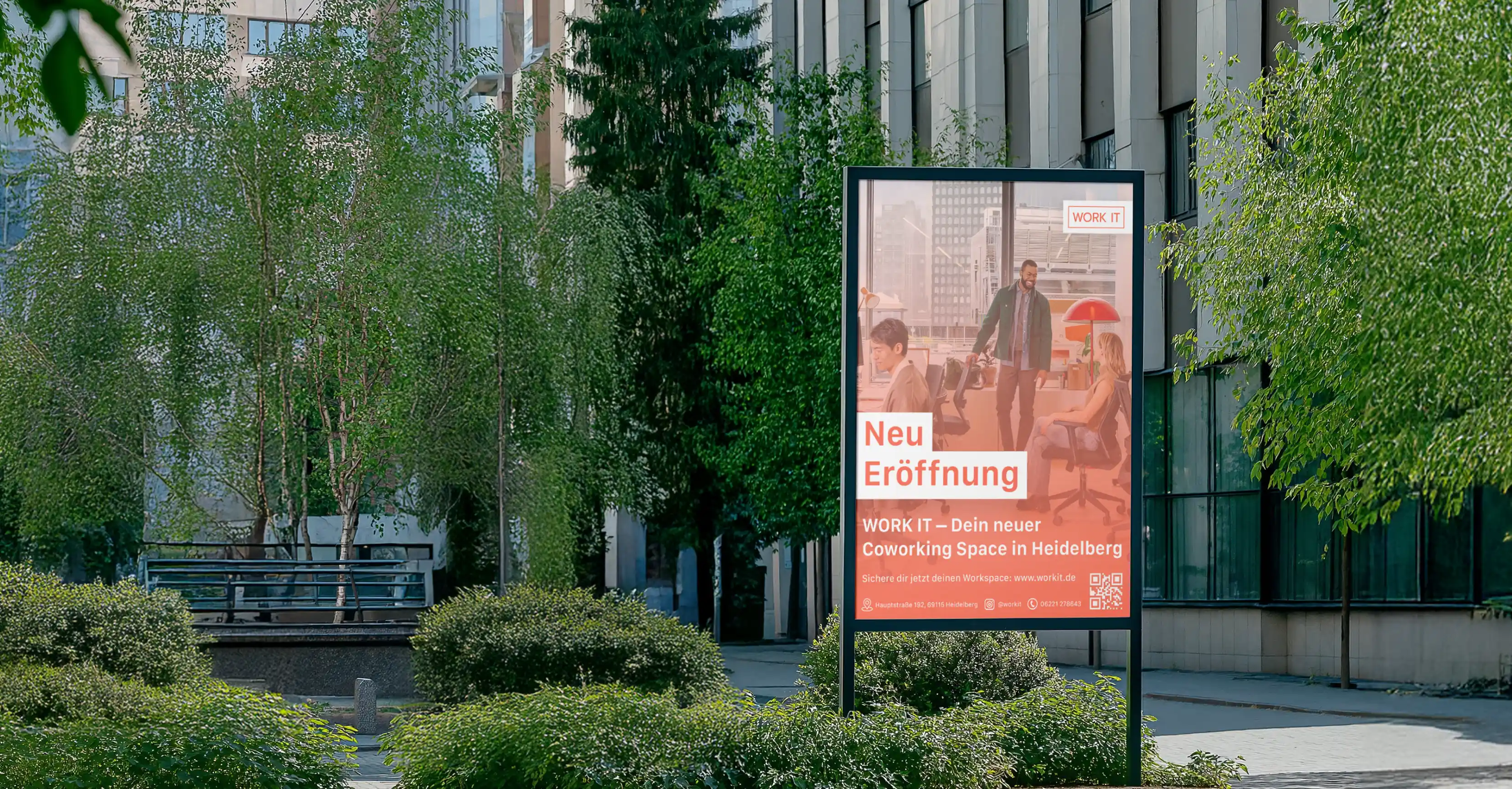
• Advertising Assets: Realistic mockups of an A1 launch poster, sticker design, and Instagram post
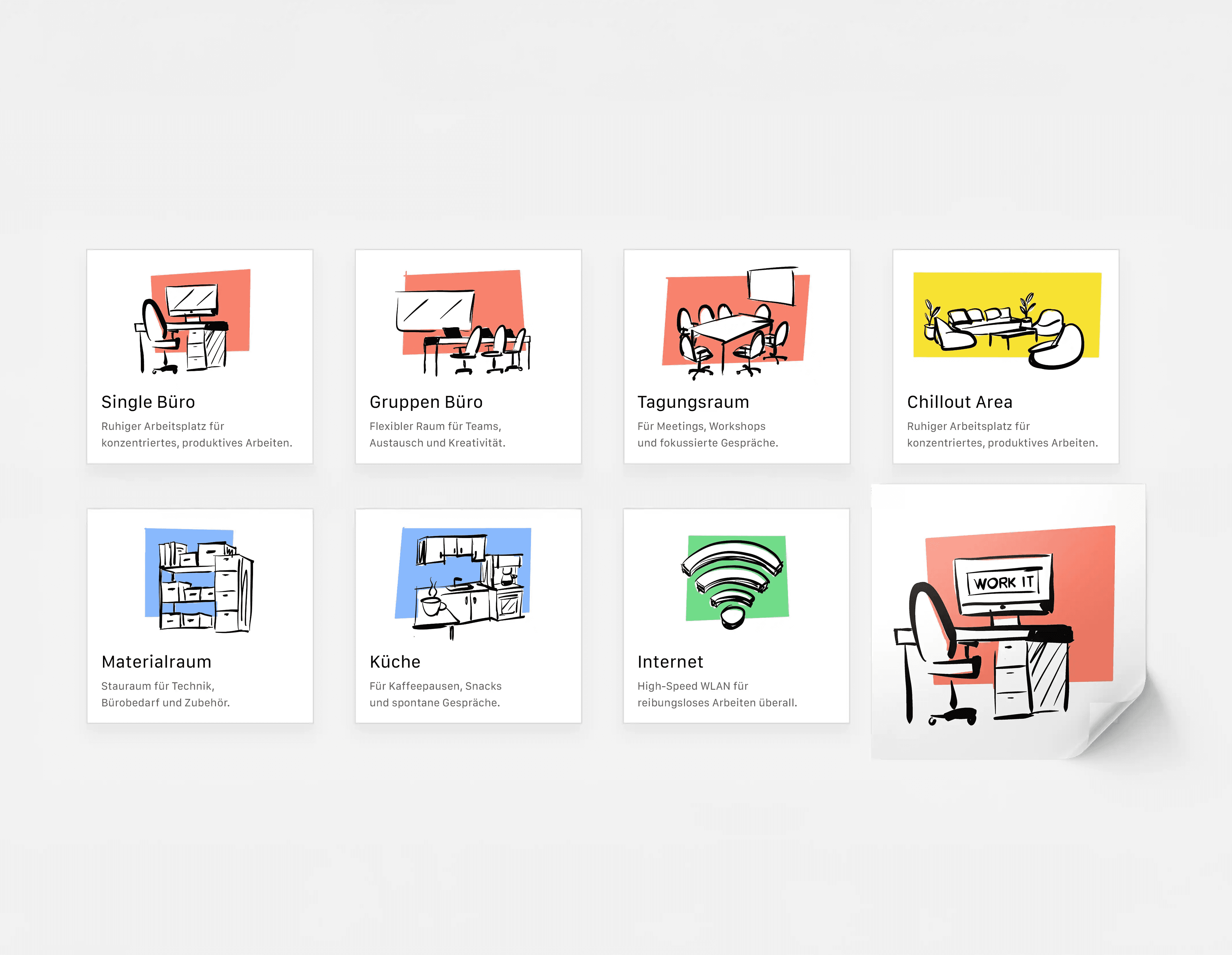
• Icon System: Custom-made icons for internal spaces (e.g., kitchen, chillout area, internet access)
• Design Consistency: All materials follow a unified visual language to build a recognizable brand identity
Tools used: Adobe Illustrator, Photoshop, InDesign, Figma
RESULTS
The final output is a compelling visual identity that reflects the spirit and functionality of a modern Co-Working Space. The consistent use of colors, type, and form creates a strong, trustworthy brand presence—one that inspires collaboration and attracts a forward-thinking community.
KEY LEARNINGS
This project deepened my understanding of integrated branding systems, spatial typography, and digital-to-print consistency. I honed my ability to think strategically while maintaining a strong design aesthetic—balancing usability, emotional connection, and brand clarity across every touchpoint.