Sora Gin
Details
PROJECT OVERVIEW
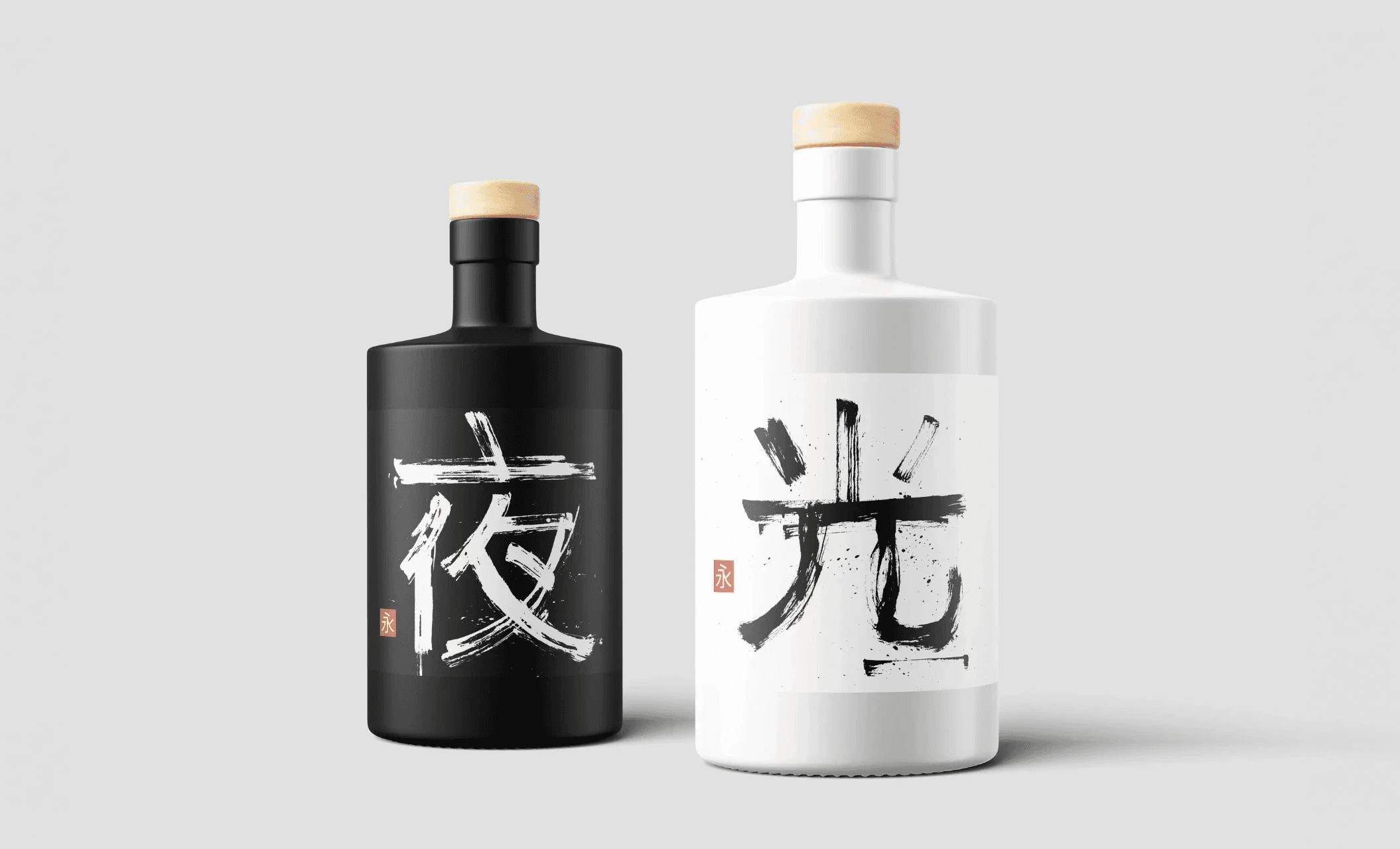
Sora Gin is a Japanese-inspired gin brand built on the duality of day and night. This concept is reflected in its two distinct products: Eternal Day (Tag) and Eternal Night (Nacht). I developed the complete brand identity, from product and packaging design to the corporate identity and website. The project is deeply rooted in minimalism, with a strong emphasis on elegance and tradition.
CHALLENGE
The goal was to create a brand that seamlessly blends modern sophistication with traditional Japanese aesthetics. The biggest challenge was developing a visual system that conveys the duality of the products while maintaining a cohesive identity. Additionally, I wanted to integrate an interactive digital experience that enhances the storytelling of the brand.
SOLUTION
To achieve a visually compelling and immersive experience, I implemented several key design elements:
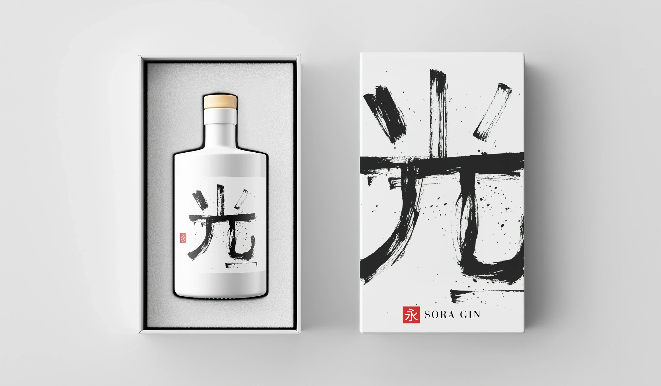
Brand Identity – Designed a refined, minimalist logo featuring Japanese calligraphy. The character used in the logo means "Eternity" or "Infinity." Combined with the characters on the individual bottles, it translates to "Eternal Day" and "Eternal Night."
Product & Packaging Design – Developed sleek bottle designs with a monochrome color palette: white for "Tag" and black for "Nacht," reinforcing the theme of balance.
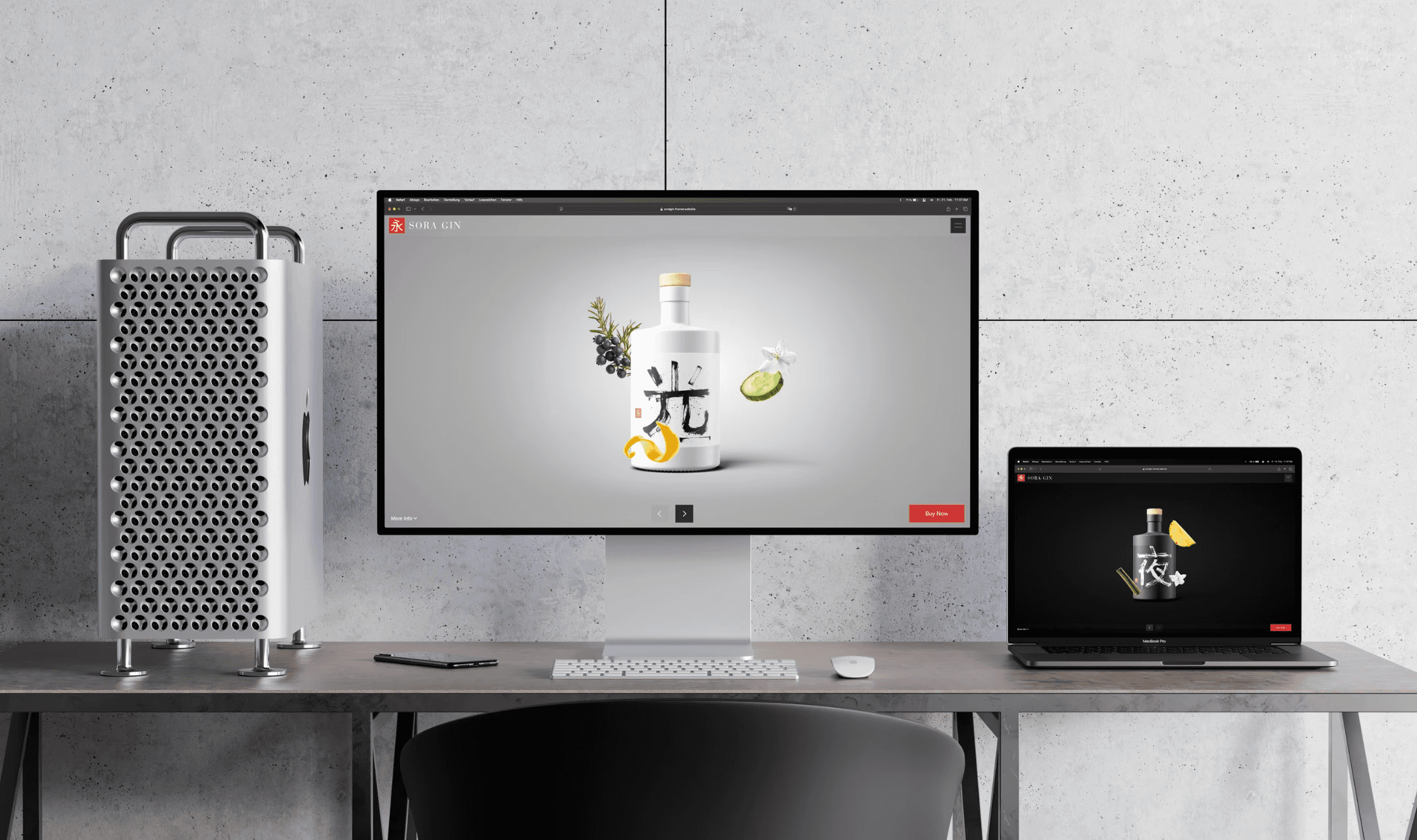
Web Experience & Motion Design – Designed and built a highly minimalistic website with a seamless motion-based transition between the two products, emphasizing their contrasting yet complementary nature.
Photography & Mockups – Created high-end visuals, including product mockups and lifestyle imagery, to bring the brand story to life.
RESULTS
The final outcome is a premium, elegant brand that embodies the timeless essence of Japanese craftsmanship while embracing modern digital design. The interactive website and its motion effects elevate the user experience, making Sora Gin a unique visual and sensory journey.
KEY LEARNINGS
This project allowed me to explore the intersection of branding, motion design, and digital storytelling. The balance between tradition and modernity was crucial in developing an identity that feels both authentic and innovative. Sora Gin stands as an example of how minimalist design can be both powerful and deeply evocative.